Thanks. Had to reload the page for the edit button to show up. Thanks again.
I modified the lock time from 1 day to 1 week right before I posted that.

I modified the lock time from 1 day to 1 week right before I posted that.


I'm still having problems with no icons but I tried to log on on my laptop and it said user doesn't exist. I think I'm going crazy cause I'm sure I exist.


Haha "Proper Sailor Speak"Its pretty much garbage. The app doesn't work anymore, no new posts showing, error boxes due to I'm assuming ios default vice all platform. I tried the app on linux, win 10, and android and its garbage on all three. Due to the "family filter" I can't express my opinion in proper sailor speak. I will switch over to my software developer speak instead:
This is just like a Microsoft windows update. It moves things around and renames things uselessly. Additionally it adds features that "Might" appeal to the social media types.
The interface is broken and barely functions cross platform. Theres a lot of tsr issues. The icons I pretty much just have to guess on. Pretty sire it is an ios thing.
All in all it is unusable from the app and using the webased version is just annoying. I appreciate that it took a lot of "work". However, a rool back to the previous version would not disappoint.


Ok, I made a change to the way the fonts load, can someone that was having issues with the little boxes appearing, clear cache and reload to see if they show up now?
Ravynn which style are you using? Fishlore Light, Dark or Blue? Style chooser is at bottom of screen.
Also, in chrome, if you press F12 it will load the dev console. If you go to the console tab can you screenshot what you have there? I'm looking for any errors or warnings since I can't reproduce it on my end. You can pm me the screenshot if you don't want to post it here.

Still showing little squares for me on chrome/edge in Windows 10
Ravynn can you press ctrl+shift+R, then press shift+F5 button then go to the console again and see if those same errors show up?

Style chooser is at the top of the screen for me but is not labeled as such. It's just the last of 3 empty boxes and the only one of the 3 that has a mouseover window. There are no styles to choose however. Clicking the box just switches between light and dark and I see no list and no mention anywhere of a blue style.Ravynn which style are you using? Fishlore Light, Dark or Blue? Style chooser is at bottom of screen.

That's there for me too. Click it and it changes from dark to light. But at the bottom you can find "fishlore light" or "fishlore dark" and if you click that you can choose between the three. So there's one at the top and a more detailed at the bottom.Style chooser is at the top of the screen for me but is not labeled as such. It's just the last of 3 empty boxes and the only one of the 3 that has a mouseover window. There are no styles to choose however. Clicking the box just switches between light and dark and I see no list and no mention anywhere of a blue style.
Chromium based Edge on Windows 10 64 bit.
Can you do ctrl+shift+R and shift+F5 and then post what the console screen looks like? I modified fonts to load from the main fishlore server isntead of the CDN.

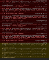


Ill pretend I know what CDN is
I do have a couple of questions.
- When I go to a Discussion I've visited before, is there any way to have it take me directly to the first post since I last visited? I belong to another forum (not related to fish-keeping) that had that option, and I really liked it.
- On the"New Posts" page, when I click on the More link at the bottom of page 1 it adds the rest of the page, but takes me back to the top. Can that be changed so we don't have to scroll back down? Or just eliminate that More button and load the whole page right way?

More reactions/likes have been added.
1. It should be doing that already. It might be messed up with all of the updates I've been making the past couple of days with the database and caching issues. Maybe see if it starts working as expected in over the next 24 hours and if it doesn't behave let me know.
2. Not sure I follow what you are saying here. That's not how the new posts page works for me. It has page numbers and not a more button at the bottom. Can you post a link to the page you are talking about?
Ooooh I see you found some more emojis too! Great work Mike!I'm liking the black (with my aqua...)and the Aquarium details below the avatar on threads is brilliant! Everyone should have their info on there!
There's the link. I can't figure out how to post a screenshot from my phone, but it lists 10 posts, then has a button that says "View more..."
I'm on a Mac desktop with IOS system. I'm sorry to give you one more problem but, when I click on the "Aquarium Details" at the top of the page, I get an Oops message error page. I first tried it yesterday and again now. Don't know if it is just me (totally possible) or if it is still being worked on?
Thanks,
LG


Agree. I can see people calling me "smart" if I am disagreeing with them over something. Doesn't even have to be about bad advise, even when people don't like what they hear, even if true. I don't see it happening often though. Most people here are quite respectful. I do like the idea of a sad reaction as I could never react to sad news. Maybe the new hug option could take the place for that.I just want to throw something out there. If it has already been said, I apologize. But two of the new reactions are "iffy" to me.
Sad and Wow. Both of which could be used negatively as a reaction to terrible advice or terrible stocking decisions or something. Even "smart" could be used in a smart alec sort of way. But especially sad and wow in my opinion.
Now...I can assure you I won't use them that way, because I am not a jerk like that. But the way people abused the "disagree" reaction years ago, I worry that some may choose to use "sad" and "wow" as the new negative reactions. They may not be labeled as negative, but I am sure they will get used that way.
Just food for thought!!
Agree. I can see people calling me "smart" if I am disagreeing with them over something. Doesn't even have to be about bad advise, even when people don't like what they hear, even if true. I don't see it happening often though. Most people here are quite respectful. I do like the idea of a sad reaction as I could never react to sad news. Maybe the new hug option could take the place for that.
I will say that I definitely miss agree. I have to like most posts now to say I agree which is kinda bland. Informative was a nice one too.


